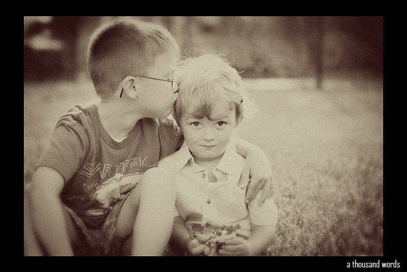
When you edit a session do you try to keep with the same look or do you do a variety? Like maybe just some with the more intense color? Anyway thanks for looking and the opinions :)
Tuesday, August 28, 2007
Opinions Please!
I am going to start editing this session but I can't decide which versions I like better, the one with more color pop or the more natural looking one (both are Renee's actions which rock by the way) I think my problem is the more natural looking one looks dull beside the color pop where as it might look fine otherwise...and the color pop one looks maybe too much next to the other one. In others words I've been looking at it too long, lol
When you edit a session do you try to keep with the same look or do you do a variety? Like maybe just some with the more intense color? Anyway thanks for looking and the opinions :)


When you edit a session do you try to keep with the same look or do you do a variety? Like maybe just some with the more intense color? Anyway thanks for looking and the opinions :)
Subscribe to:
Post Comments (Atom)

About Me
Blogs that Rock My Face Off
About Me
I am a 27 year old wife, friend, and mother. I am a take it one day at a time kinda gal. I love to have fun and capture memories. I believe that a positive attitude makes a postive life so have a great day and enjoy my blog :) Thank you for looking and taking an interest.


6 comments:
Wow, that's a real toss-up for me, too! I honestly like them both - I go back and forth depending on which one I'm looking at. Either way, it's a great pic! (sorry I know I'm no help, LOL)
Lol, me too...maybe I am thinking about it too much :) Thanks for looking though:)
Bobbi, I'm seeing a lot of yellow in it, so I like the first one better, but it's an adorable pic! I'm wondering if you could use the saturation sponge to bring out the pink in her shirt. :)
Hmmm I'm seeing some kind of cast in the second one too. But the first one seems like it needs something. Don't ask me what though lol. This is a great pic though!
I'm also seeing a bit of yellow...but they still look sharp and gorgeous.
But I love them both.
These are cute, both of them. Worth playing a bit more. I would punch up the color too.
Post a Comment